
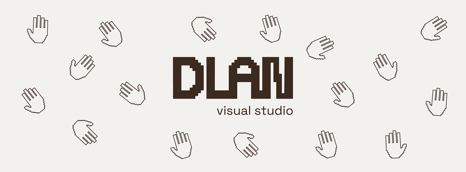
DLAN (slo.) = palm. It is a dynamic design space for the curious - a place of experimentation and the touch point (no pun intended) of many different mediums. By connecting design with social good, DLAN aims to foster inclusion and uplift everyone involved. What inspires us is people, their stories and their diversity. Through our design practice we strive to cultivate a sense of connection and community.
The design direction is very minimalistic, combining the palm element as the logotype and the pixelated text to showcase the multimedia aspect of DLAN. I didn't want the visual identity to be too overwhelming, therefore I chose a simple beige and brown color scheme. Therefore the visual identity is now overshadowing the design projects published under DLAN.