
Stage 1: research
User research & persona
Based on findings from 2014 research made by Gumirakiza et al. I determined who is my target audience for this project. Based on this information I created a persona:
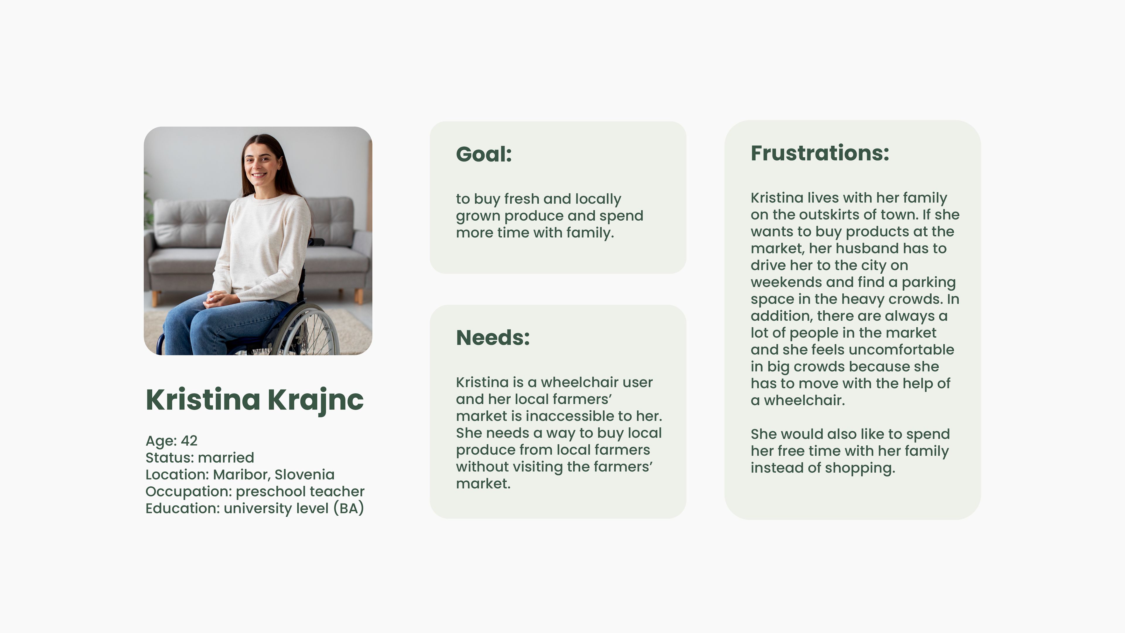
Gumirakiza, J. D., Curtis, K. R., Bosworth, R. Who Attends Farmers' Markets and Why? Understanding Consumers and their Motivations. International Food and Agribusiness Management Review, 17, (2014), 2, str. 65-82
Market research
In market research stage I analyzed 5 similar websites (Farmshare, Market Wagon, Field to Family, Jem Domače and Optifarm). The main goal of the research was to find which features are implemented well and where can we see opportunities for improvement.
- Well implemented features: animated elements, blog with recipes or farmer stories, page for frequently asked questions, back-to-top button, similar item recommendations, customer chat.
- Opportunities for improvement: non-uniform branding (colors, spacing, size…), inaccessible websites and poorly indicated user path.
Stage 2: defining problems & goals
Problems:
❌ Inaccessibility of farmers' markets to users with physical and cognitive barriers.
❌ Physical distance from farmers' markets for users who live in the suburbs.
❌ Difficulty finding a parking spot due to large crowds at farmers' markets on the weekends.
Goals:
🎯 Create an accessible solution that allows users to buy local produce and support local farmers.
🎯 At-home delivery with sustainable means of transport (bikes and e-scooters).
🎯 Make buying local produce accessible to users who can't visit farmers' markets due to physical or cognitive barriers.
Measure of success: number of purchases
Stage 3: prototype
Storyboard
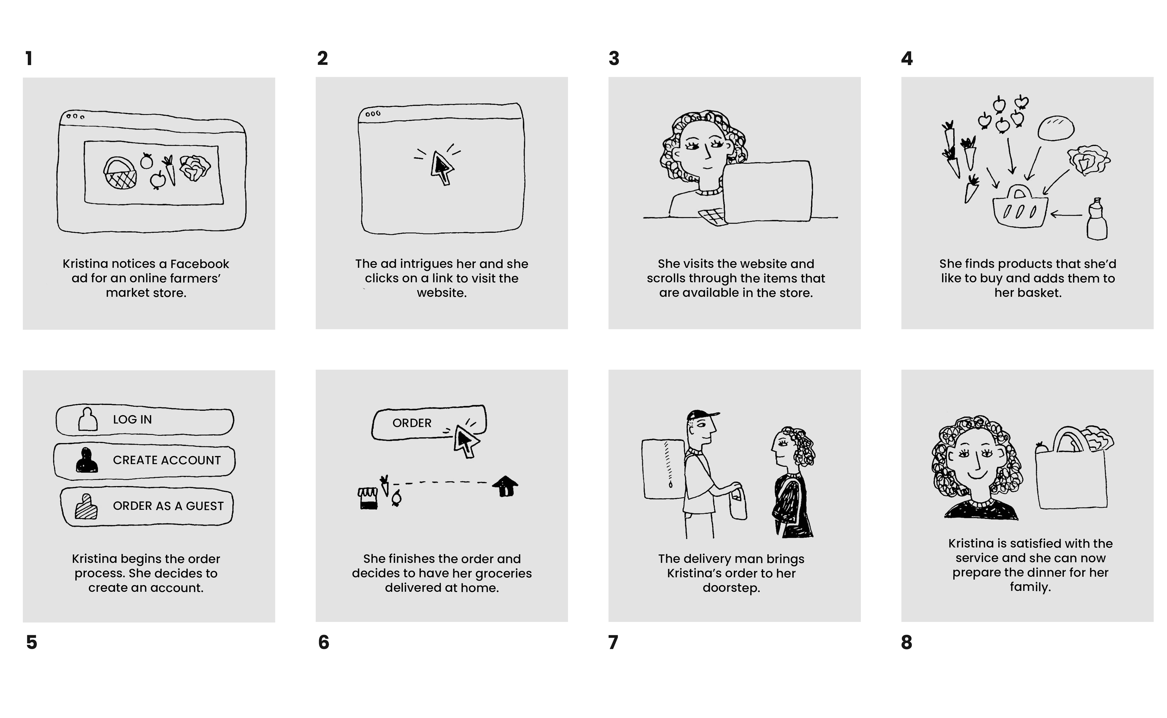
Storyboard - entire user path
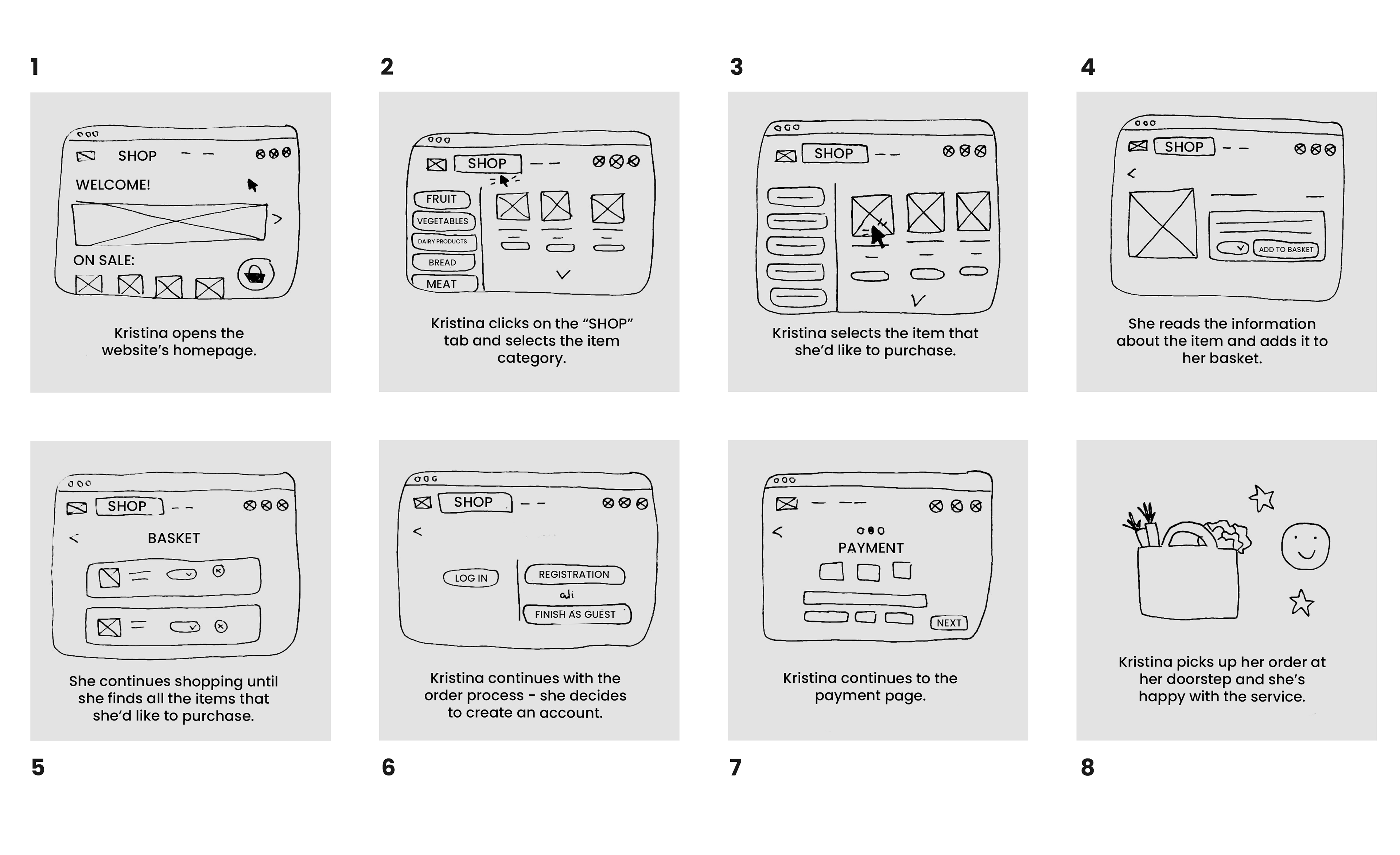
Storyboard - in-app user path
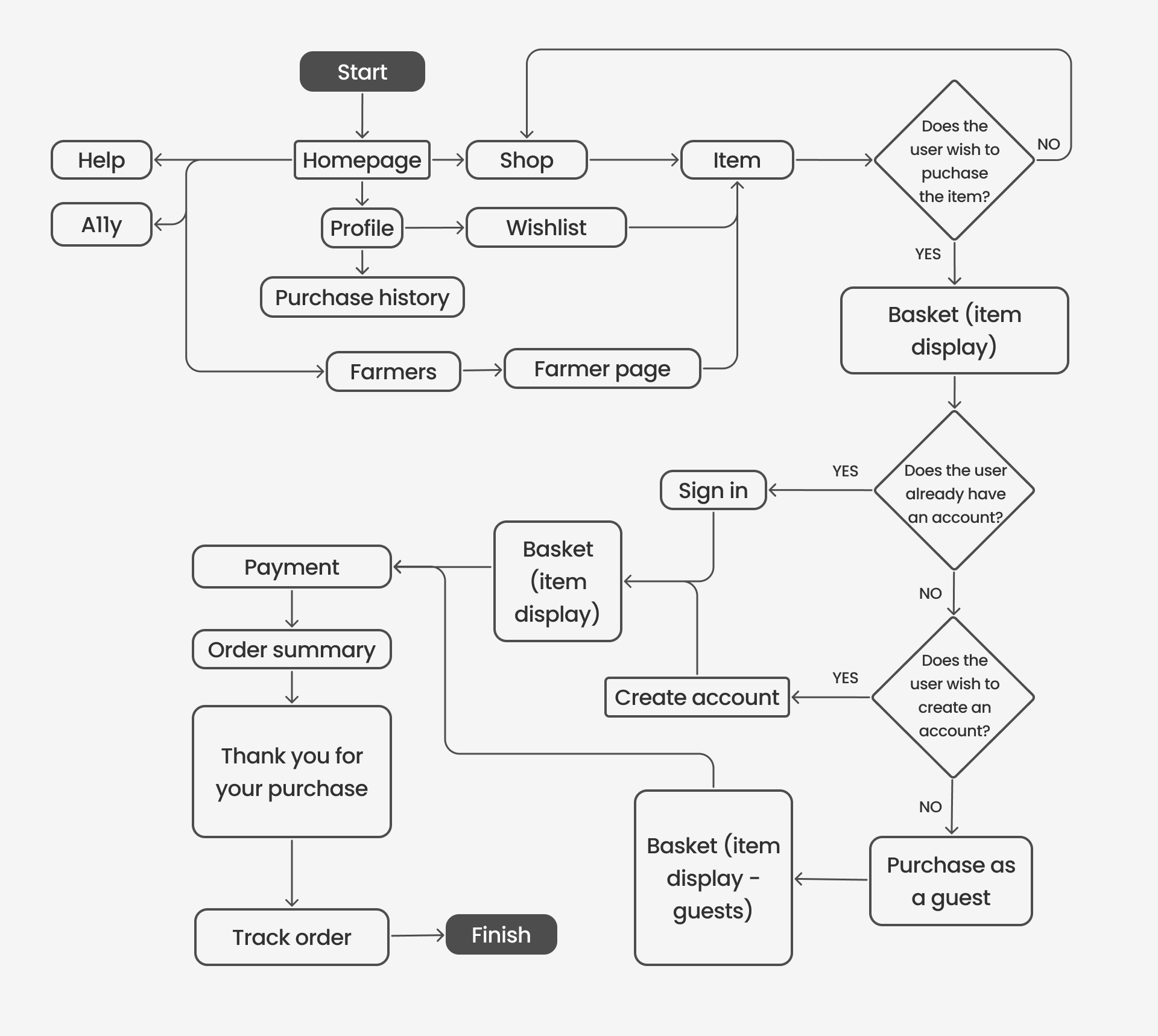
User flow
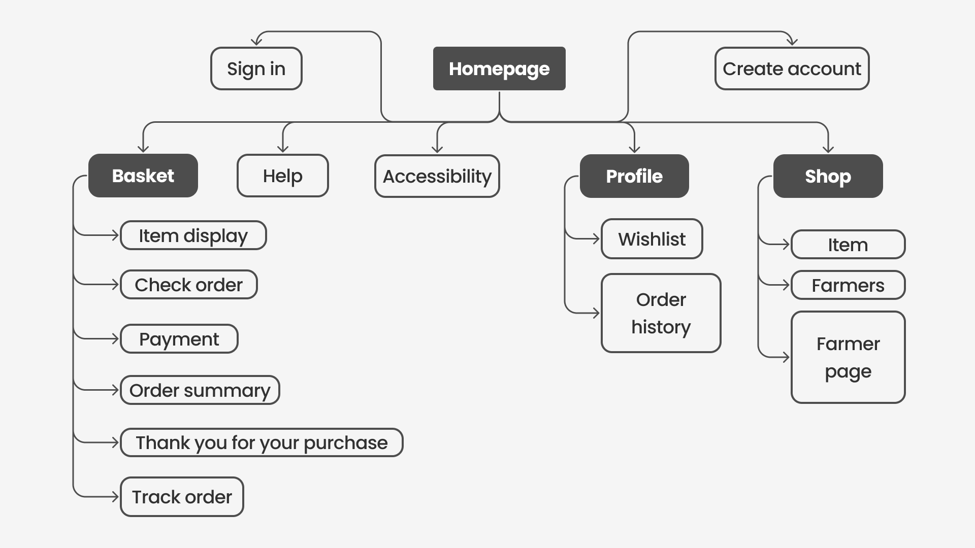
Sitemap
Lo-fi & hi-fi prototype
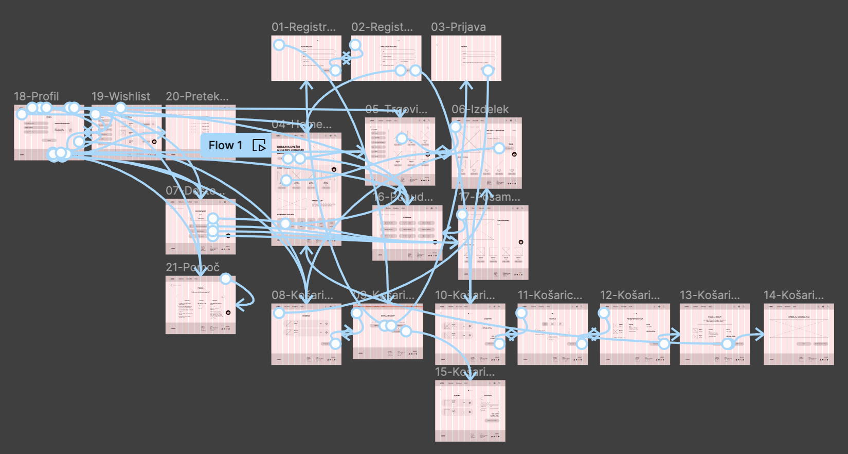
After determining the user flow, I created wireframes of each page and connected them in a lo-fi prototype. When the flow of the lo-fi prototype was fully functional, I approach the hi-fi prototype, where I determined the visual elements.
I created 5 versions of prototypes based on WCAG requirements: basic version, translated version (English), version with larger text, desaturated version and high-contrast version.
Lo-fi prototype
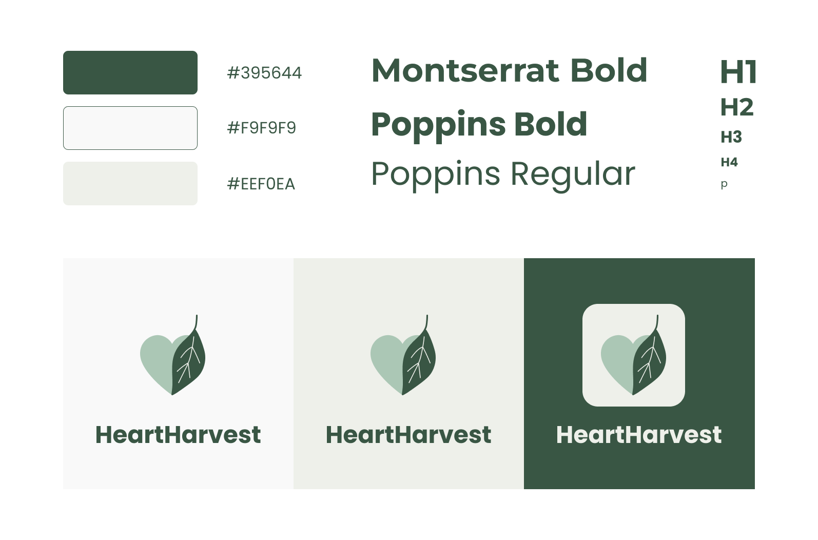
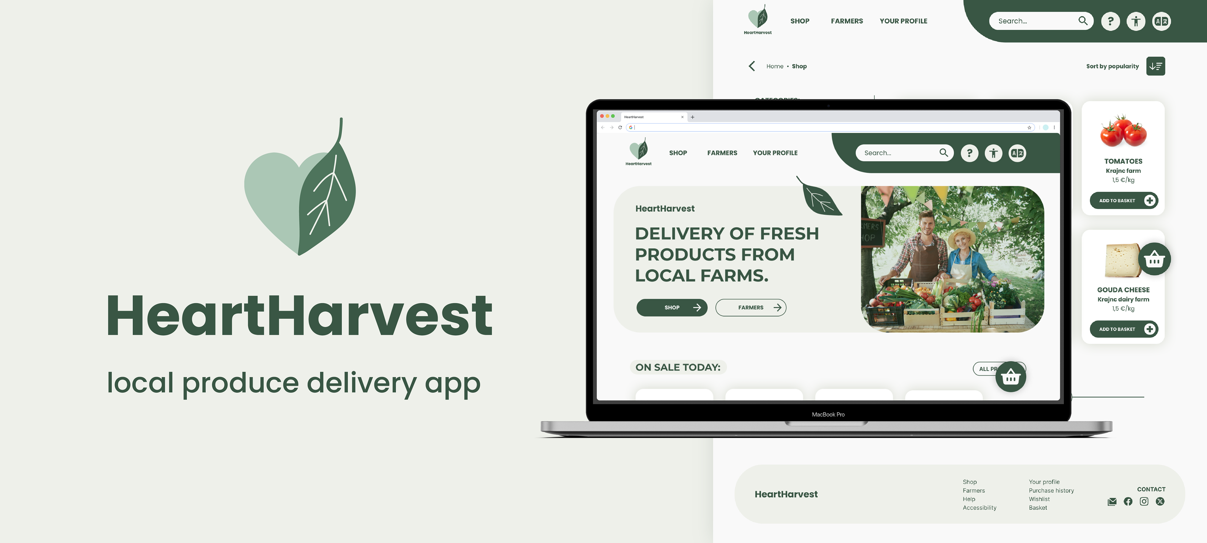
App branding - color scheme and typography
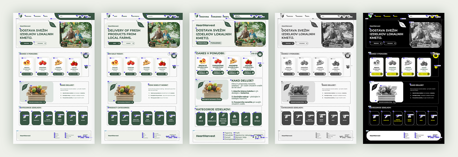
Hi-fi homepage screens (all versions)
Stage 4: usability testing
Accessibility checklist
The first stage in testing was checking how well the prototype meets WCAG accessibility guidelines. I created a checklist that summarises WCAG guidelines as well as behavioural psychology laws in UX (which I researched in the theoretical part of my thesis). I checked that the prototype meets all A level requirements and most of AA and AAA level requirements from this checklist:
For adjusting prototype accessibility, I used Figma plugin Stark. I checked that all elements fit WCAG standards, including colors, typography, alt text and button size. With Stark I also marked page landmarks, determined element order and determined titles (H1-H6).
Clueify
I also ran tests with Figma plugin Clueify. This plugin analyses elements with the help of AI and generates a heatmap that shows how well the elements function (which elements are most prevalent on a screen). I noticed that photos draw most attention and I was generally satisfied with the analysis, since it highlighted areas that I wanted to be most noticeable (items, buttons, main text).
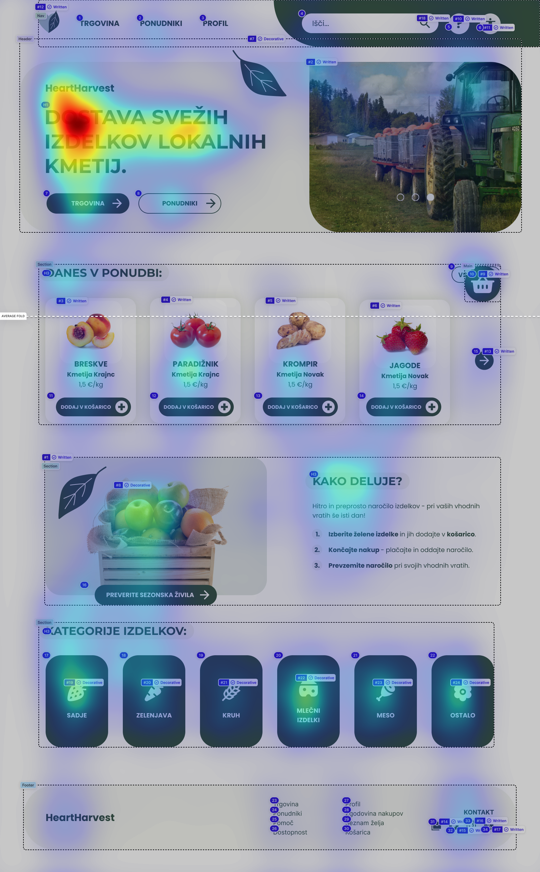
Homepage
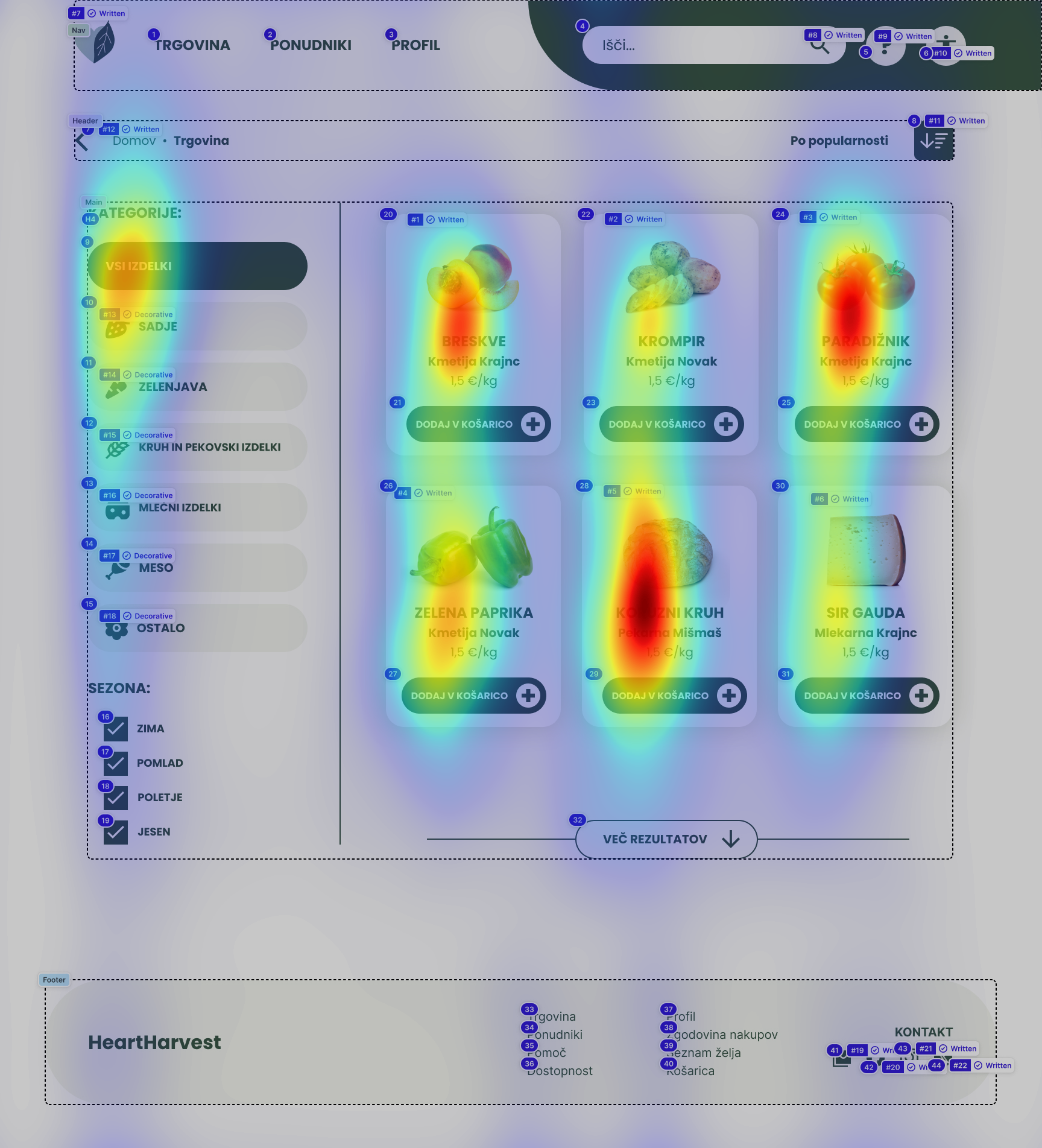
Shop
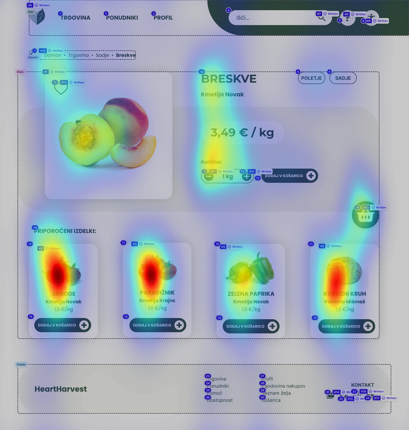
Item page
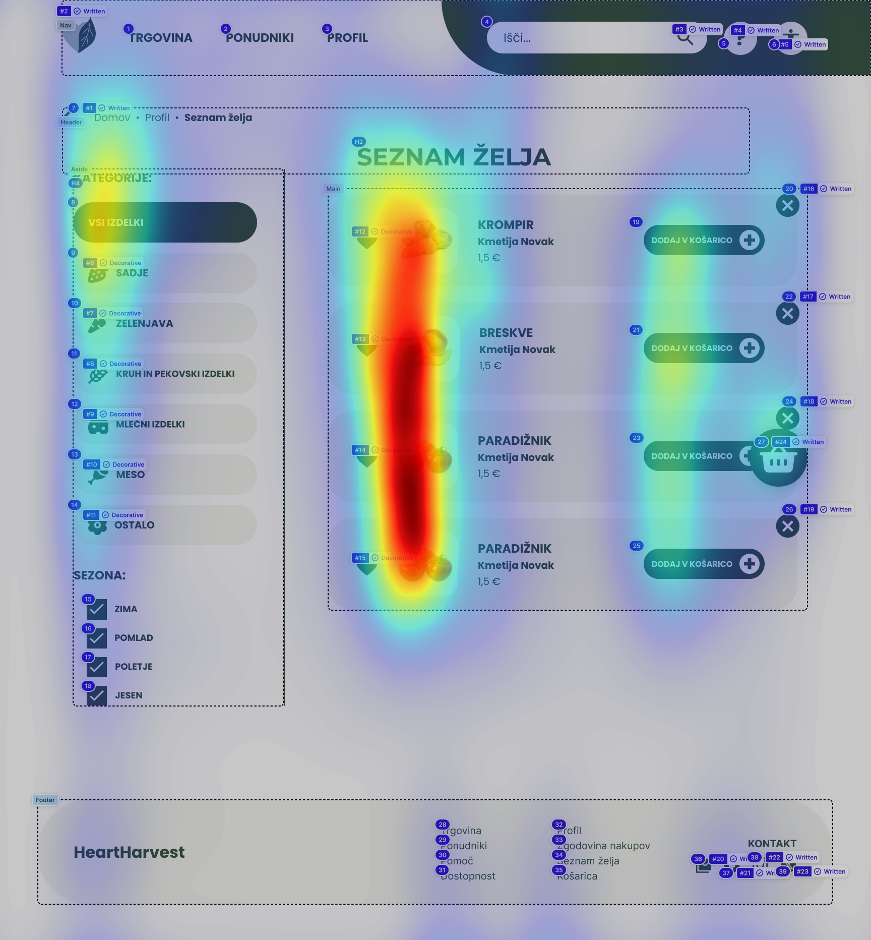
Wishlist
Usability testing
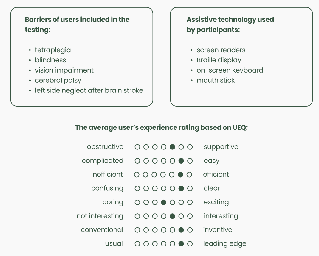
Usability testing took place in-person in May 2024. There were 6 participants included in the testing (2 male and 4 female). I made sure that users are similar to the findings published in a 2014 research made by Gumirakiza et al. - there’s a similar percantage of women (66%) and users were middle-aged. Users included in the testing were members of various disability associations in Maribor and Ljubljana region, aged between 33 and 74.
First I presented users with tasks and observed how they interact with the prototype - how they approach tasks and where are the pain points. Lastly, each user also filled out a UEQ (User Experience Questionnaire), which helped me determine their satisfaction quantitatively. Here are findings from the usability testing:
First I presented users with tasks and observed how they interact with the prototype - how they approach tasks and where are the pain points. Lastly, each user also filled out a UEQ (User Experience Questionnaire), which helped me determine their satisfaction quantitatively. Here are findings from the usability testing:
Key takeaways:
💡 Figma supports screen reader use by automatically transforming prototype elements into HTML. Testing the prototype with a screen reader revealed mistakes with buttons, text hierarchy and unclear barrier between Figma interface and prototype. Editing the code is also not available, which makes it impossible to test the prototype accurately.
💡 Shopping process was simple enough for everyone to understand, even an elder user, who only made one prior online purchase before.
💡 “Add to wishlist” task confused the users due to the lack of textual clues (just the icon wasn’t enough).
💡 The buttons should be positioned higher (above the scrolling point). Scrolling was a pain point for the user who tested the prototype using a mouth stick.
💡 Avoid ambiguous wording for buttons in the shopping basket (“continue with purchase” could be interpreted as going back to the shop page instead of the next stage in the user’s order process) - this is especially important for users with cognitive barriers.
Next steps:
🎯 Implementation with corrections from usability testing.
🎯 Performing another round of tests, mainly to see how well the prototype works for users that use screen readers.
🎯 Considering new elements such as animations to make the prototype more exciting (based on UEQ results).
🎯 Performing another round of tests, mainly to see how well the prototype works for users that use screen readers.
🎯 Considering new elements such as animations to make the prototype more exciting (based on UEQ results).